
The modern pages in SharePoint online look absolutely great! With the additional web part that are added to the available web parts improvements are made. Today I noticed a few new web parts.
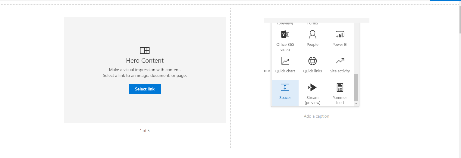
The Divider web part and the Spacer web part.

They are both very different web parts but they both help you to waste space on your page.
Within no time it is possible to create a waste of space. with two Dividers and a spacer web part.

Then why bother adding these web parts to a page? And more importantly why does Microsoft bother adding these web parts to the available web parts on the modern web parts. It must be more important to add other web parts. In the traditional web part pages some of the most popular web parts have been the search web parts and the content by query web parts. While there isn’t really a replacement web part available it doesn’t seem to make much sense to have these web parts there.
Is this maybe to make web parts line up nicely when you have multiple columns next to each other with multiple web parts? Nope, you can simply use sections for that. So that when you have two web parts with a separate height the sections will make sure that the web parts are nicely lined up.
So, I think it is time for a bit of a competition… Please send me great examples of the use of these two web parts in real sites. The best examples will win … well I’ll add you to the top 10 best examples of the waste of space web parts list. Imagine the honour of being added to that list.
Discover more from SharePains
Subscribe to get the latest posts sent to your email.
Pieter Veenstra

Is your business still running on paper trails, sprawling Excel files, or ageing Access databases? There's a better way — and I can show you exactly what it looks like. I'm the Technical Director of Vantage 365, a Microsoft solutions consultancy working with clients across the UK, the Netherlands, and worldwide. For over 30 years I've been turning messy, manual business processes into clean, automated systems that save time, reduce errors, and give teams the visibility they need to make better decisions. SharePains is not just any blog run by a Microsoft MVP. Have you ever used Try-Catch in Power Automate? The original post about Try-Catch in Power Automate can still be found on this site, https://sharepains.com/2018/02/07/try-catch-finally-in-power-automate-flow/ Or have you ever used the Pieter’s method to avoid variables and speed up your flows? https://sharepains.com/2020/03/11/pieters-method-for-advanced-in-flows/ You can contact me using contact@sharepains.com
Pieter Veenstra
Is your business still running on paper trails, sprawling Excel files, or ageing Access databases? There's a better way — and I can show you exactly what it looks like. I'm the Technical Director of Vantage 365, a Microsoft solutions consultancy working with clients across the UK, the Netherlands, and worldwide. For over 30 years I've been turning messy, manual business processes into clean, automated systems that save time, reduce errors, and give teams the visibility they need to make better decisions. SharePains is not just any blog run by a Microsoft MVP. Have you ever used Try-Catch in Power Automate? The original post about Try-Catch in Power Automate can still be found on this site, https://sharepains.com/2018/02/07/try-catch-finally-in-power-automate-flow/ Or have you ever used the Pieter’s method to avoid variables and speed up your flows? https://sharepains.com/2020/03/11/pieters-method-for-advanced-in-flows/ You can contact me using contact@sharepains.com
maybe on mobile display it make sense to “paginate” your content using this space
I hope the office ribbon height will be reduced in future ? it takes 25% of the space at the moment…
There is even an option to not display the spacer on mobile. There isn’t an option to hide the spacer on desktop though.